The 2016 San Francisco Decorator Showcase
We finally had a chance to check out the 2016 San Francisco Decorator Showcase House before closing on Memorial Day. I was so excited to have a morning off from wallpaper production to feed my spirit with what some local designers are doing.
The home at 298 Chestnut Street is an elegant three-story stone structure.
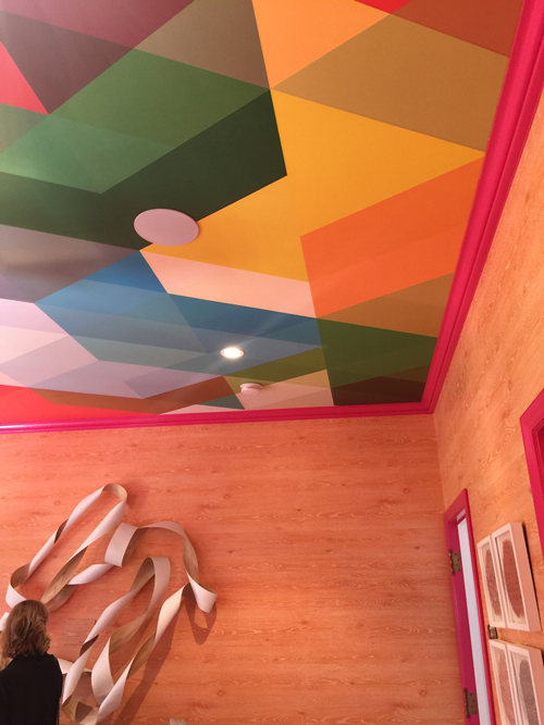
After being greeted at the door, I started my tour upstairs in the Guest Bedroom designed by Ann Lowengart Interiors.
First of all the ceiling is wallpapered in one of our favorite wallpapers and the walls were faux finished in a gorgeous faux bois pattern. A winning combination all around!
Next, in the following scenes, there were some smaller spaces using digital wallpaper on the walls and ceiling. I moved right along to the deck area with breathtaking views of the bay and the Golden Gate.
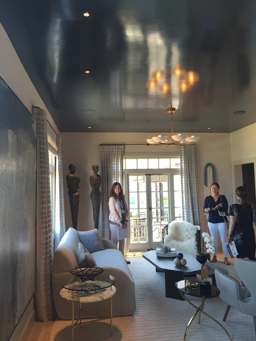
The Master Bedroom Suite, designed by Tineke Triggs of Artistic Design for Living, had a beautiful subtle Venetian plaster throughout and some custom patterning behind the headboard that was thankfully toned down in the same tone as the rest of the Venetian plaster. What got me going was the high gloss ceiling with the matted plaster walls. For me, this is an exciting combination, and I'm not sure why more people don't go BOLD with high gloss finish.
The Dining Room and Kitchen by Martin Kobus Home were quite elegant. The light fixtures were stunning.
Moving on to the foyer: which featured a faux finish applique, made for a nice quiet transition to the sitting room which featured another richly textured vinyl wallpaper. Though it might have been plaster. The execution was so well done that it was hard to differentiate between the variety of wall finishes.
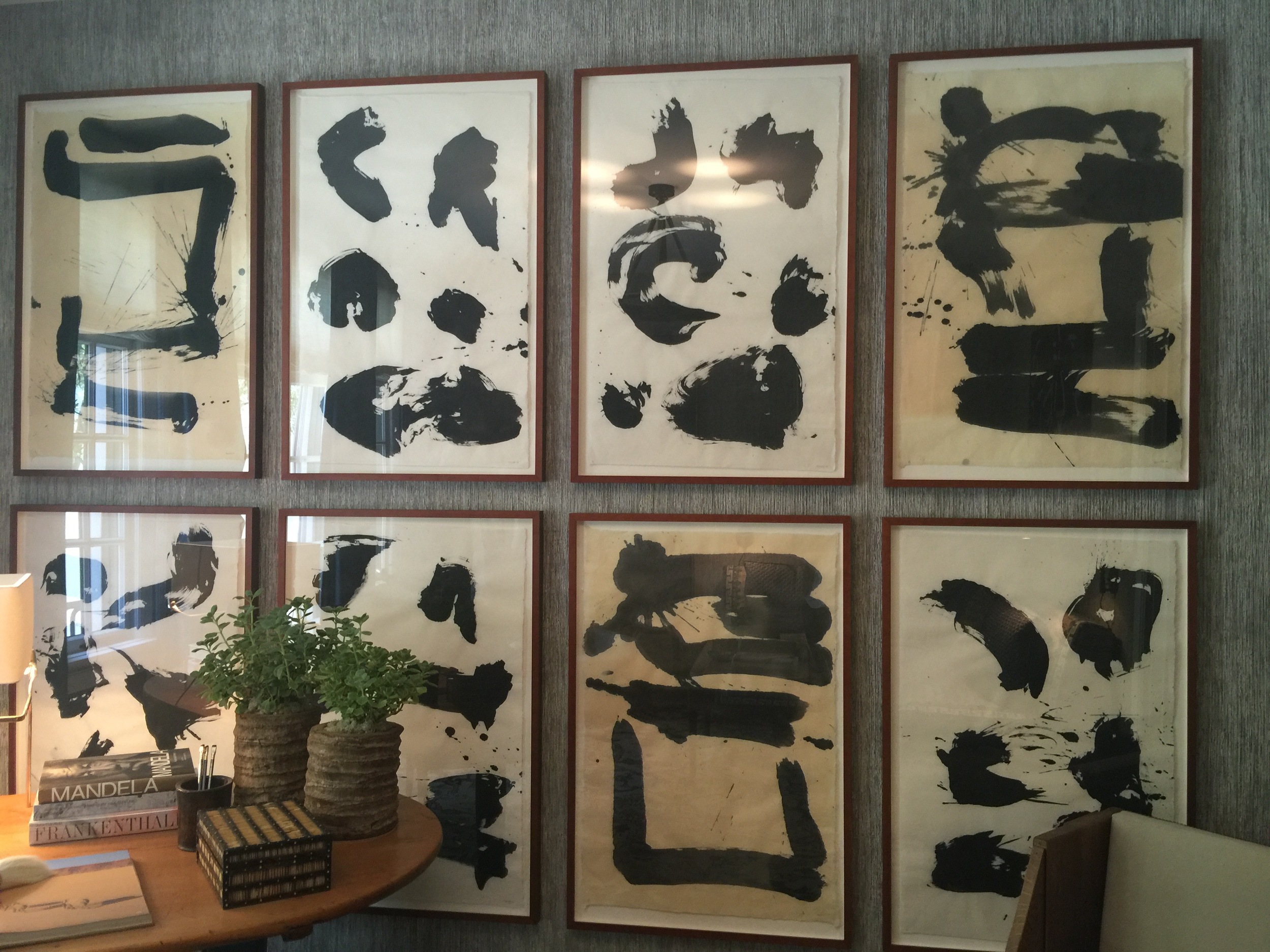
The fabrics by Zak and Fox and the fantastic gallery wall, designed by Stephan Jones, are what made this room inviting, for me.
Going downstairs:
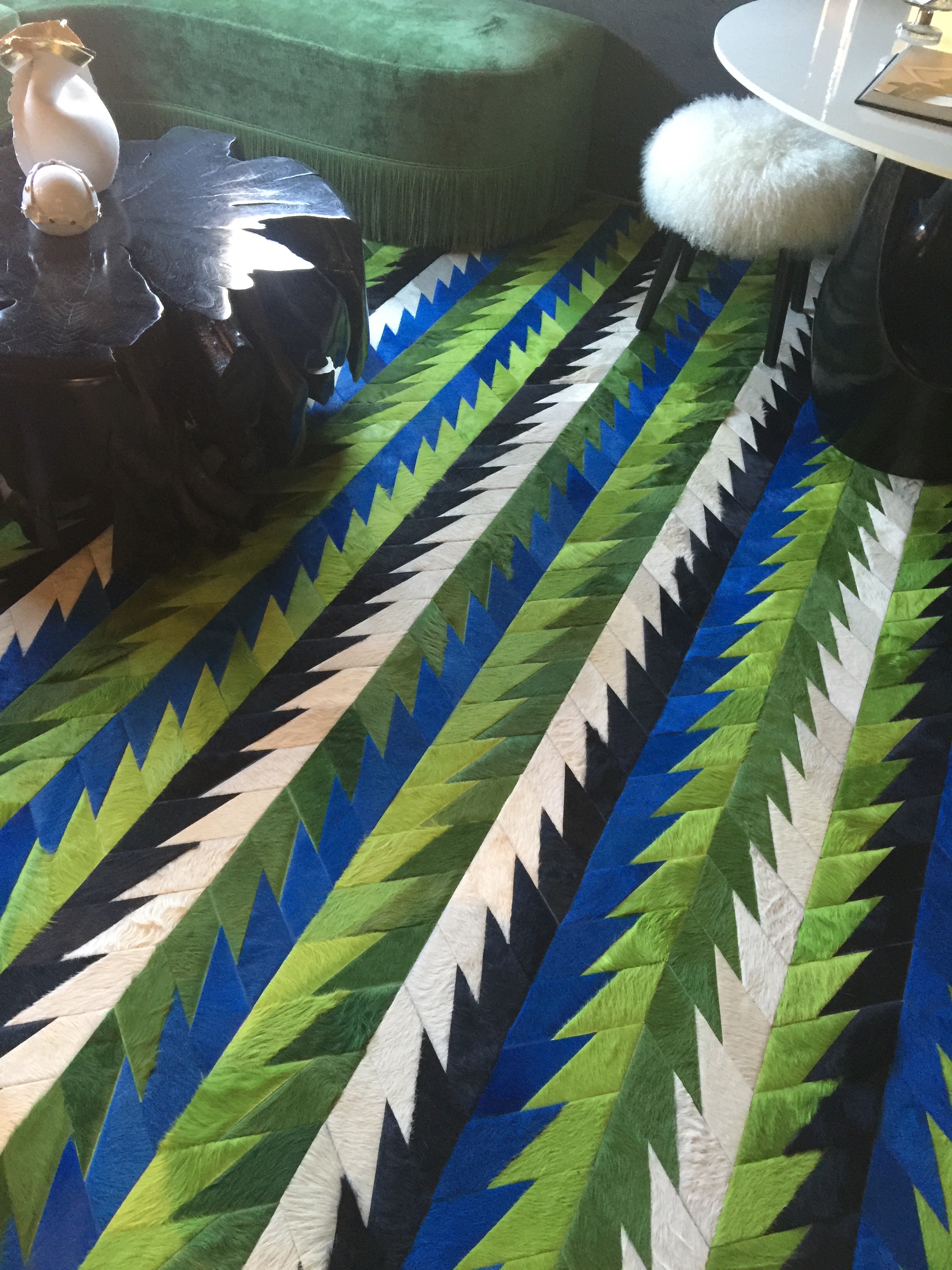
This room was all about the rug. Evars + Anderson Interiors made this space quite inviting.
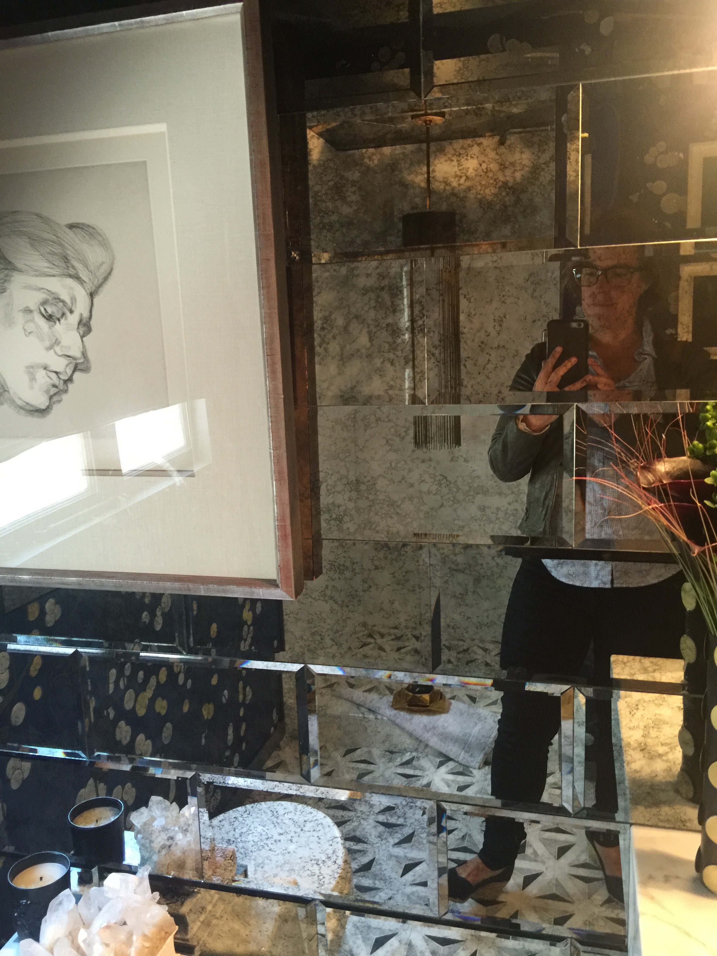
The wallpaper and mirrored walls, OMG - everything. I loved this space. Even the ceiling had fabulous WALLPAPER? I think it was wallpaper. Again, I spent far too much time looking for seams. Designed by Shelley and Company.
Read more about the 2016 San Francisco Decorator Showcase home in the current issue of San Francisco Cottages & Gardens.


